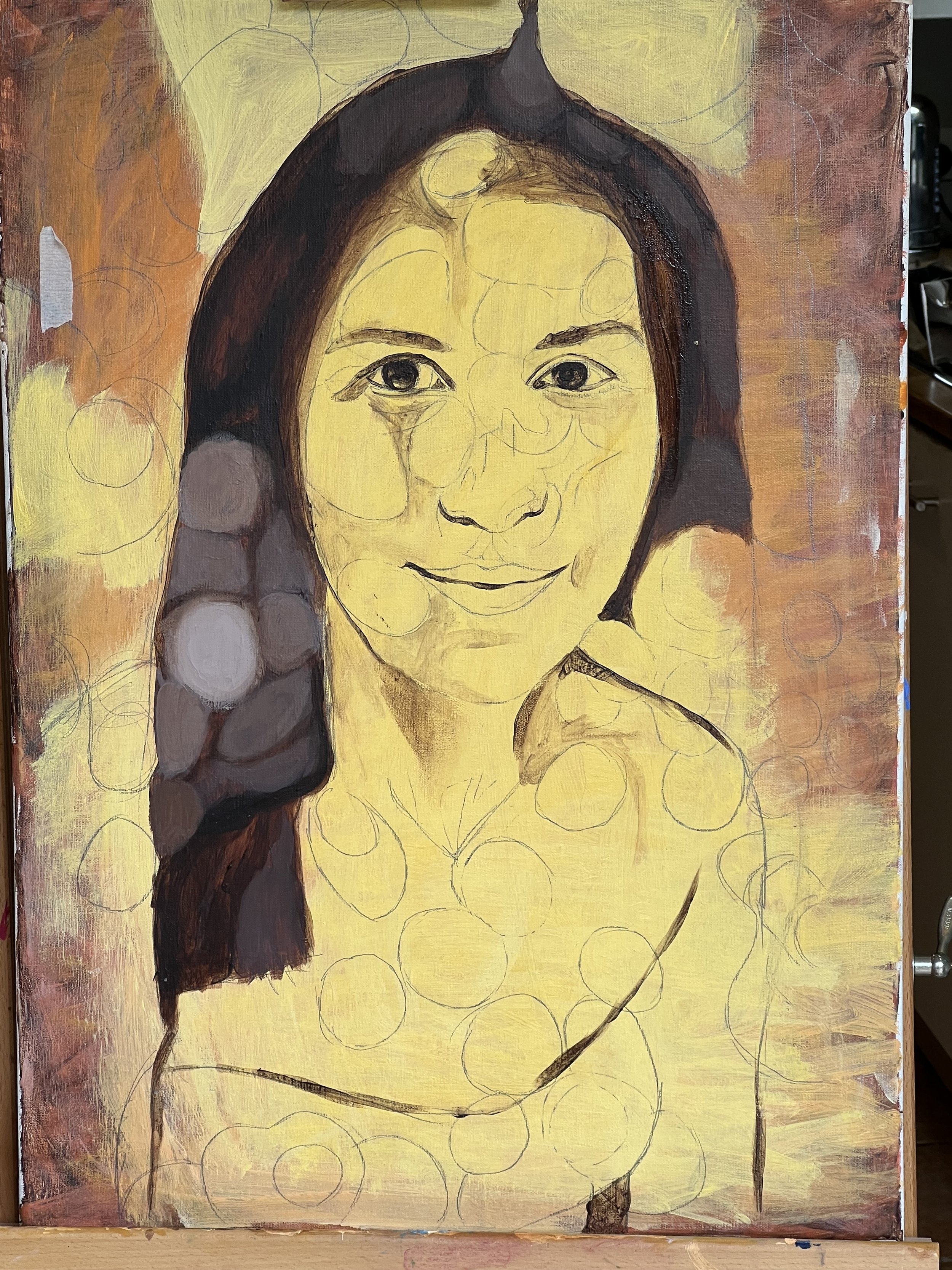
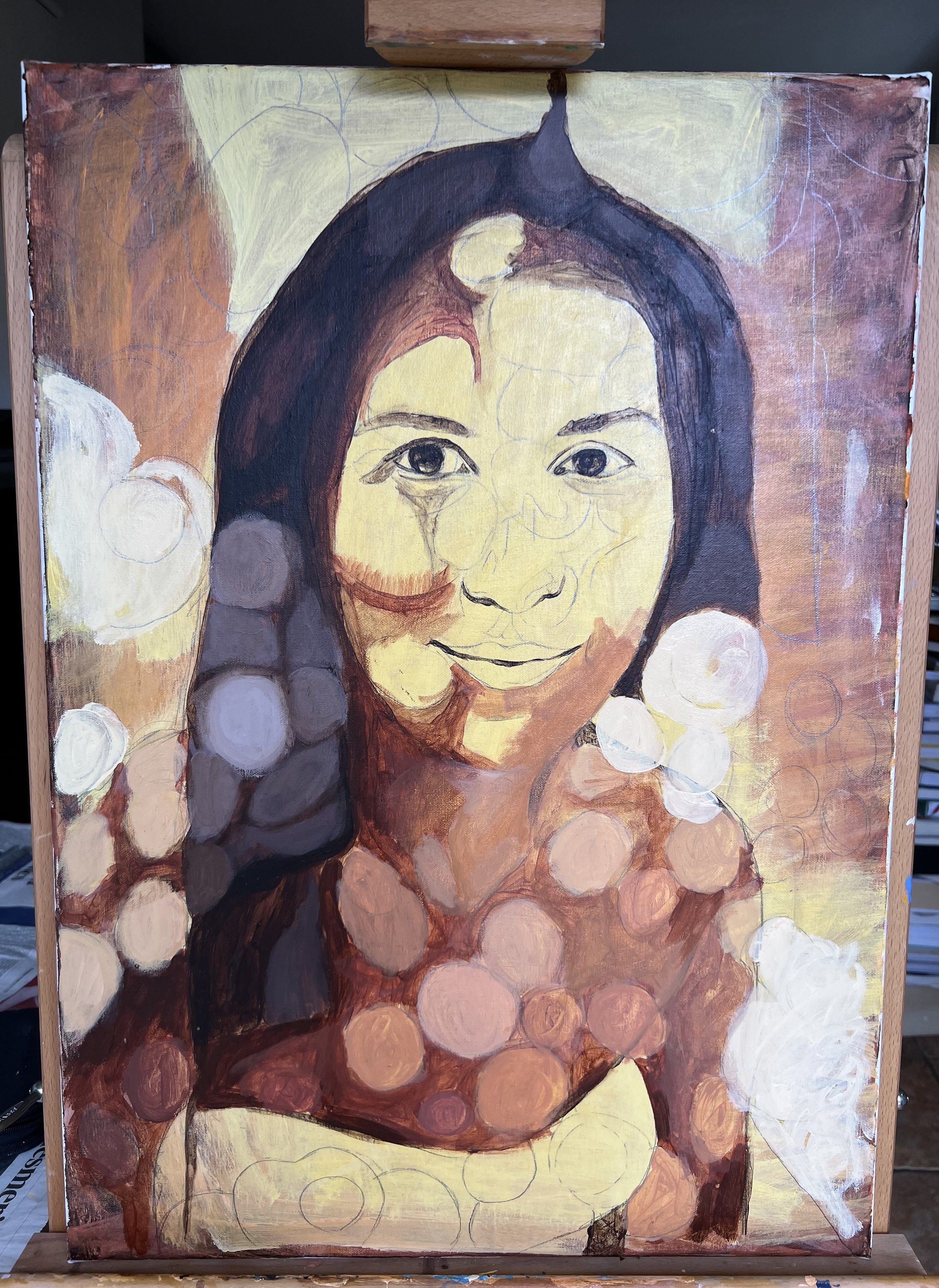
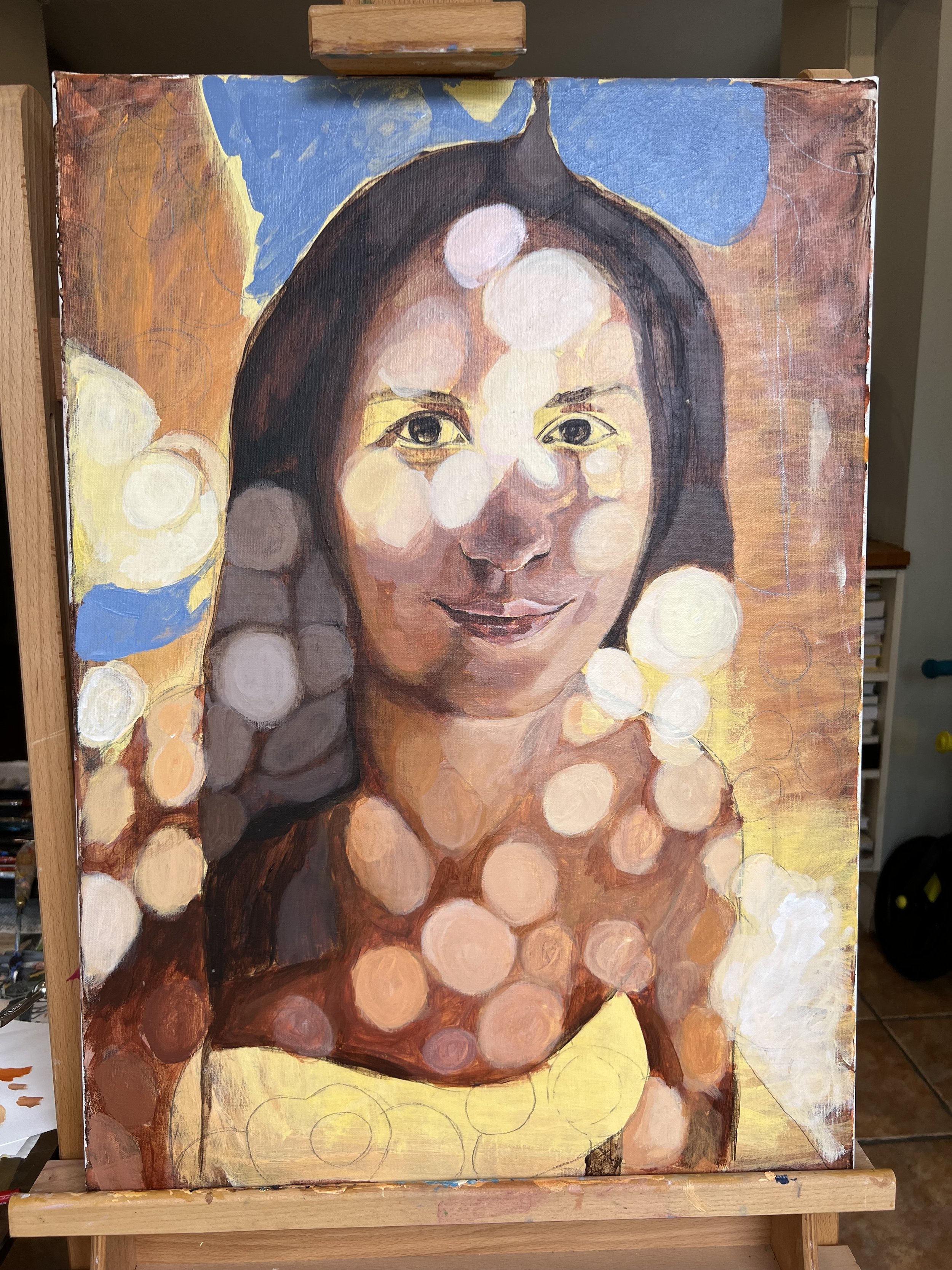
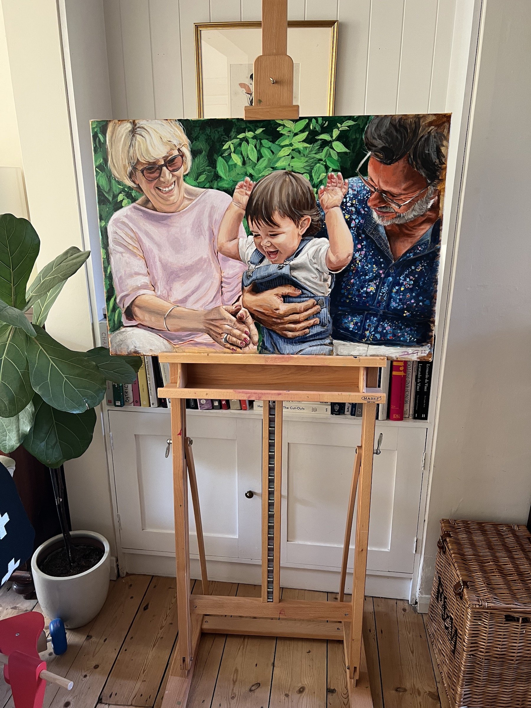
FIR GROVE GARDEN - Process pictures

FIR GROVE GARDEN - Oil & Acrylic on Canvas 70.0 x 50.0 cm. August 2024.

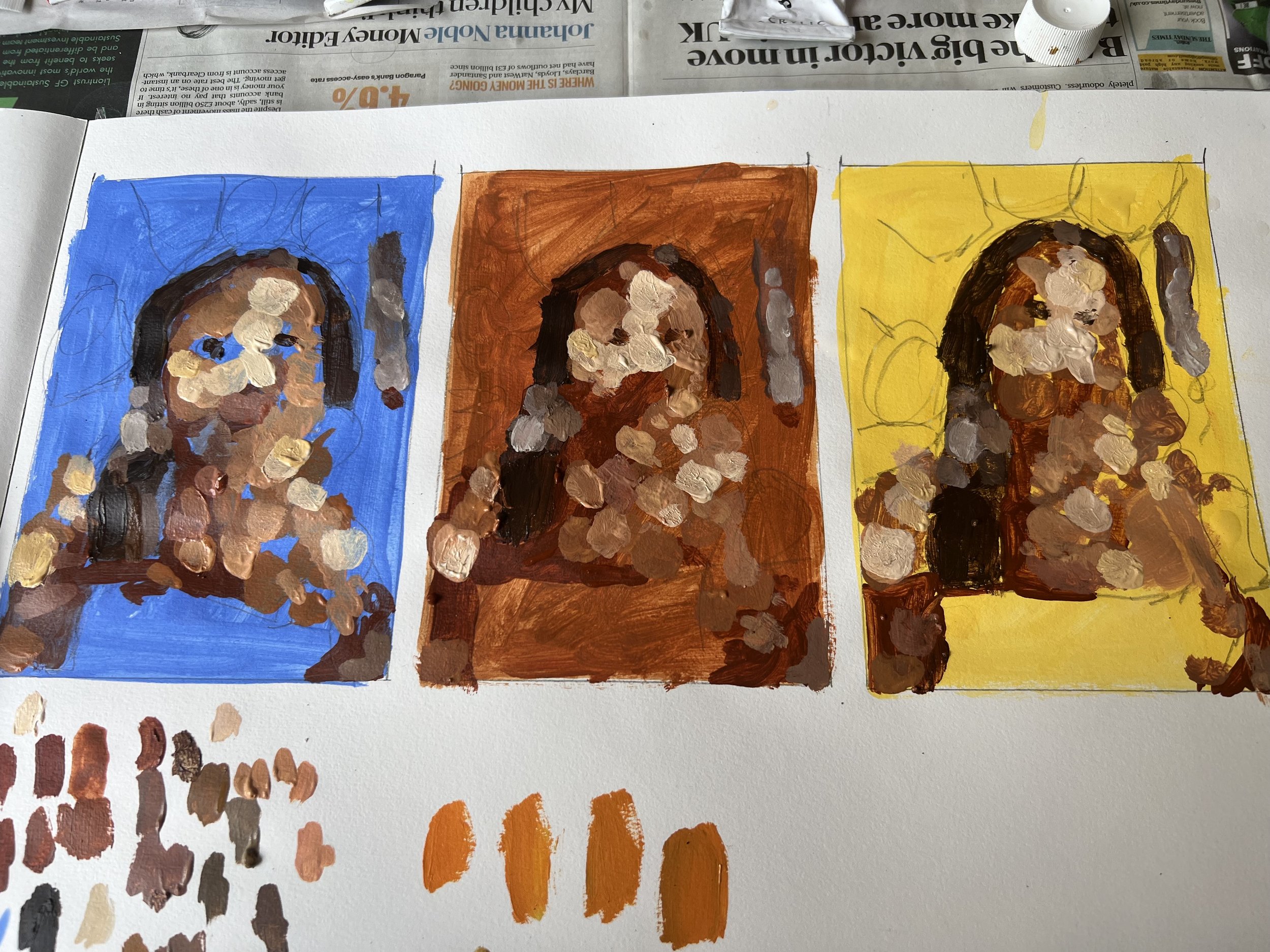
A collection of studies and process photographs from this portrait experiment. From both the small poster study and the full size canavs.

As with most of my recent paintings, I was experimenting with coloured base colours for the background.  In this picture, I was trying out a pale orange and bright green for the skin and clothing base layer on some small poster studies size pieces of paper. I enjoy creating these studies as they are often more creative than the final painting execution. The colours were much more vivid than I initially envisaged - but I liked this. The plan for the main painting was to use a more lilac background colour. 

For both figures, I worked the white top to a more detailed level, but I liked the trousers being looser in brush strokes.  I made the colour a more vivid blueish mint green than in real life, which was a little different to how I imagined it, but I was happy with it as an experiment. The right hand side figure - I left the trousers unfinished, in the same way as the poster study.  After marking the figures out in pencil I blocked out the background with a slight vignette, which slowly gets lost with the layers of slightly translucent paint. 

LUNCH IN LINDOS process overview

MIDDAY IN GREECE

My latest portrait painting LUNCH IN LINDOS. Oil & Acrylic on Canvas 70.0 x 50.0 cm. August 2023. 

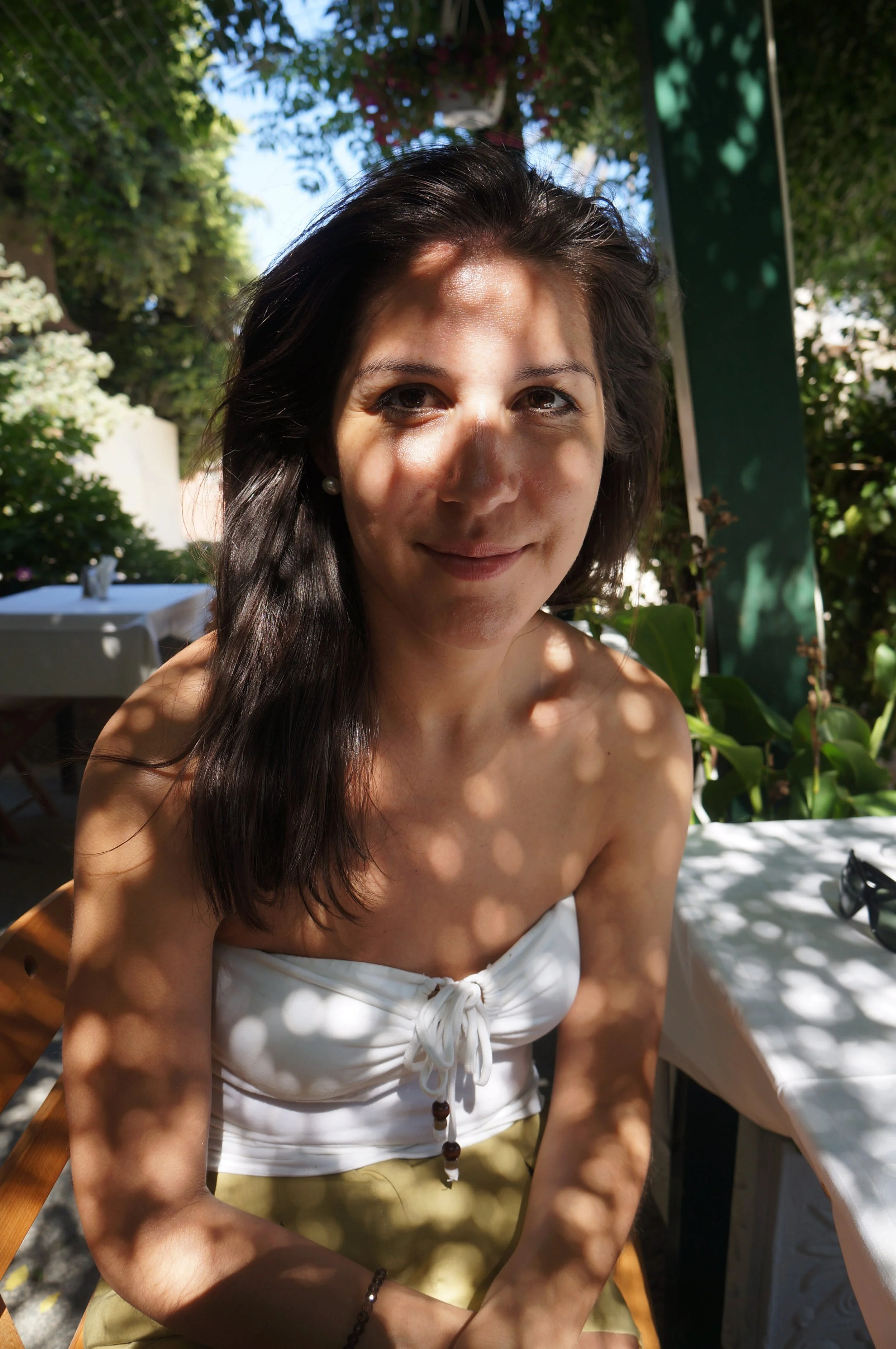
Inspired by a photograph captured during a serene moment in Greece back in 2013, this painting encapsulates the essence of that idyllic scene. Positioned within the comforting embrace of a sun-dappled restaurant, my wife became both muse and subject. I felt the photograph worked well in its own right, so the plan was to abstract the picture and capture the mood of the moment more fully.

The intricate interplay of light and shadow, cast by the lush canopy above, mesmerized me. It took over a decade to muster the confidence necessary to translate these nuanced light levels onto canvas, particularly the delicate nuances around the eyes.

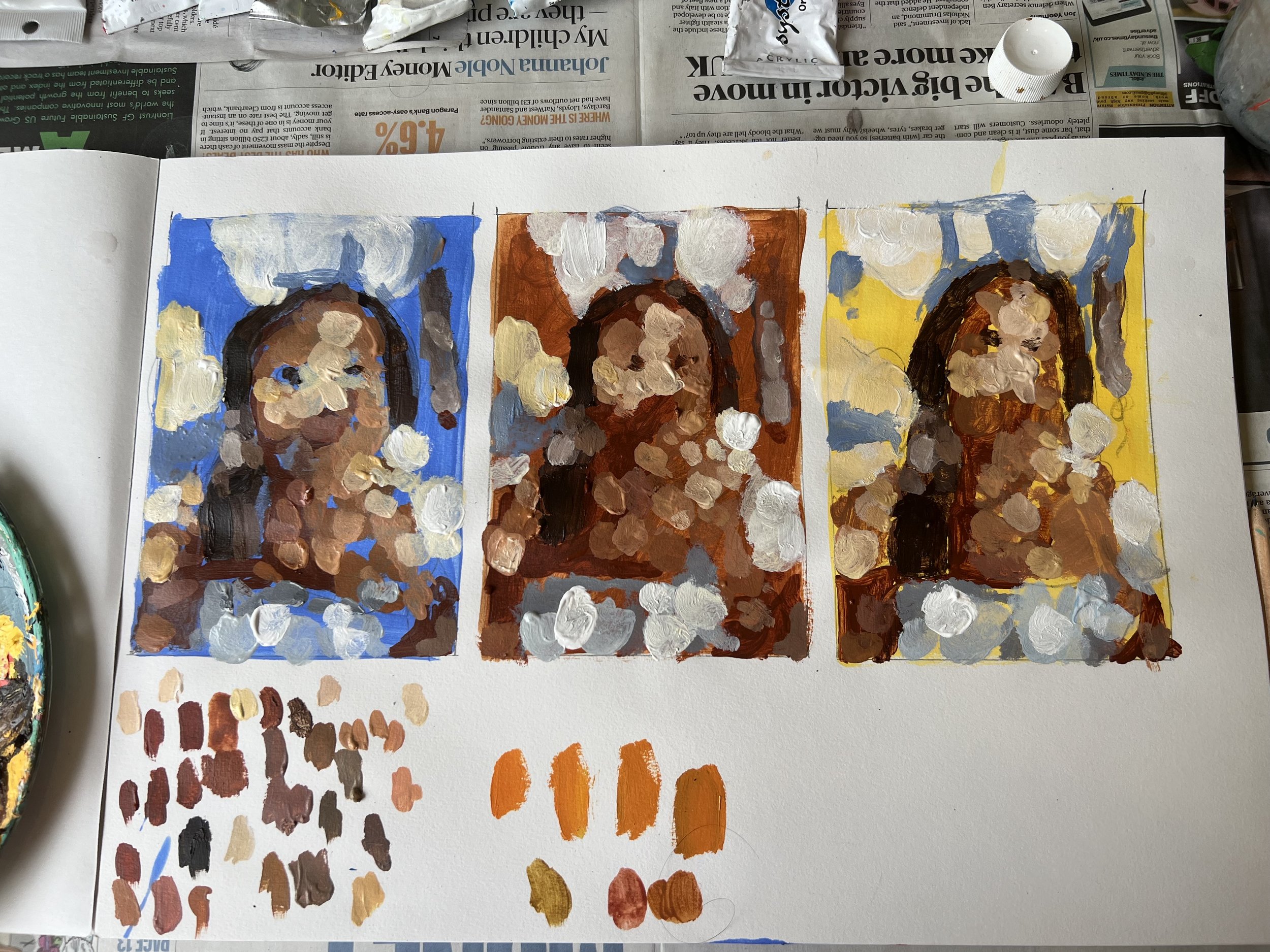
The journey began with a series of poster study sketches, exploring the interplay of colours that would best evoke the mood of the moment. Experimentation led me to refine the underpainting hues, ultimately settling on a harmonious balance of Cyan, burnt Sienna, and Cadmium yellow.
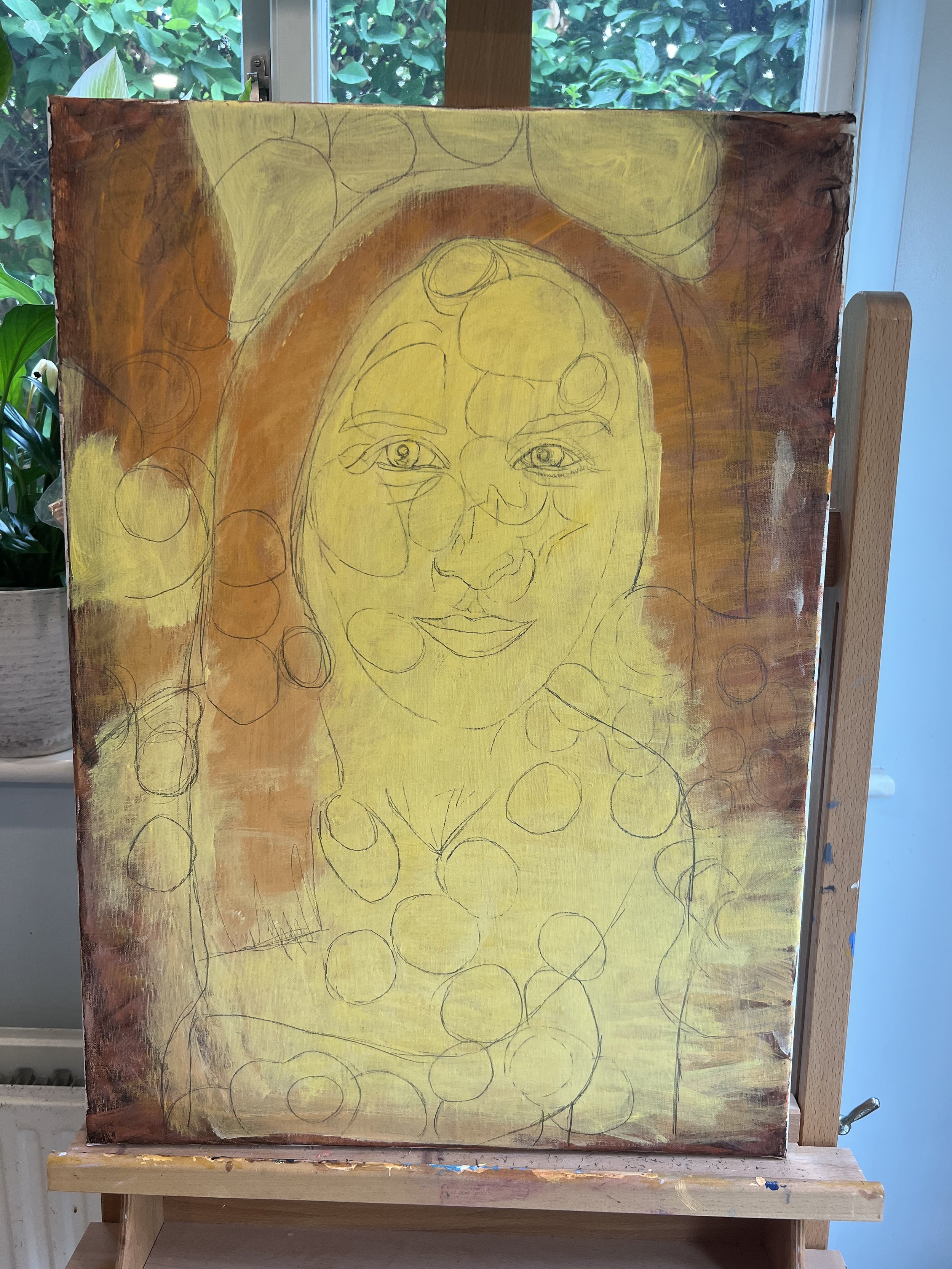
Layer by layer, the canvas came to life. Thin, fluid strokes allowed for a gradual buildup of depth and dimension, mirroring the gentle dance of light across the scene. The luminous spheres of light were meticulously crafted through successive layers, washes, and glazes, each stroke contributing to the ethereal ambience.

A pivotal decision arose when considering the background palette. A subtle touch of greyish blue, juxtaposed against the warm orange tones, added a captivating depth to the composition. Knowing when to halt the creative process, I pondered whether it was time to cease refining the painting, finding solace in its current state of completion.

Yet, the eyes remained a focal point, holding the essence of the subject's soul. Deliberate and cautious, I approached this final phase, unsure of the level of detail warranted. I left the eyes until last to paint as I didn't know how detailed I wanted them to look. After a short session working them up, I thought they looked okay in more detail. As soon as I started painting a hint of eyelashes over the right eye I stopped and decided they were complete

SEBASTIAN AT HOPE COTTAGE

SEBASTIAN AT HOPE COTTAGE

70th Birthday gift - Acrylic on canvas 90.0 cm x 60.0 cm - April 2022

After 15 days and approximately 100 hours of painting, over a 9-month period, my latest portrait painting is complete. Taken from a photograph I took during my son, Sebastian’s 1st Birthday party in the garden at Hope Cottage, Great Shelford, Cambridge. I instantly loved the picture as a photograph in it’s own right and thought it would have the potential for an interesting painting.

His Granny & Grandpa are on either side of Sebastian - and most importantly it told a story of the day, featuring three generations of the family, given I took the photograph and painted the portrait! I also liked the movement in the composition, particularly with Seb’s arms moving upwards, which accented his youth exuberance alongside the calm and nurturing nature of his grandparents. The rule of thirds composition is evident in the picture if you split it into sections - with Sebastion in the centre of the picture and his hands in the upper third.

I had a few concerns with the picture, it did feel a little cramped, but on the flip side of this, it also helped it feel more intimate. There were possibly too many hands featured, but I also liked the juxtaposition between the size of Grandpa’s hands and Sebastian’s hands - being so large and small side my side. The bright green plants in the background of the picture anchored the composition, evoking a feeling of life and abundance and the green complemented the pale pink of Granny’s top.

In hindsight, I underestimate the difficulty of the painting being a triple portrait with a photographic perspective to it, particularly towards the top left and right edges of the composition and it was much more detailed than I originally planned. I managed to finish the painting of the faces, and hands after the first 9 days by which stage it was mid-September 2021, I did all of the painting outside and as the days were getting shorter I decide to stop pause the painting - not restarting until April 2022 when the days were longer and the improved natural daylight returned. All of these factors contributed towards the painting taking so long to complete.

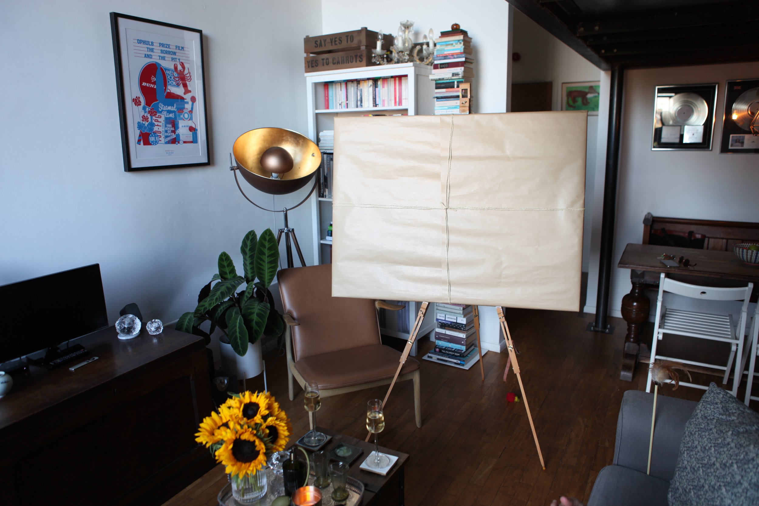
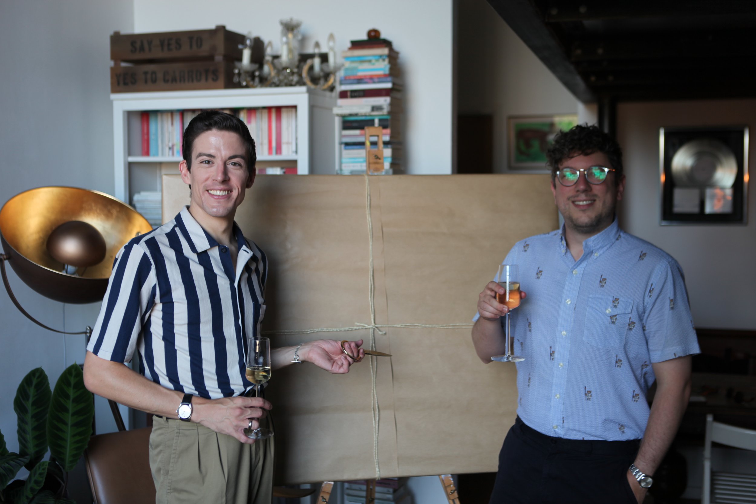
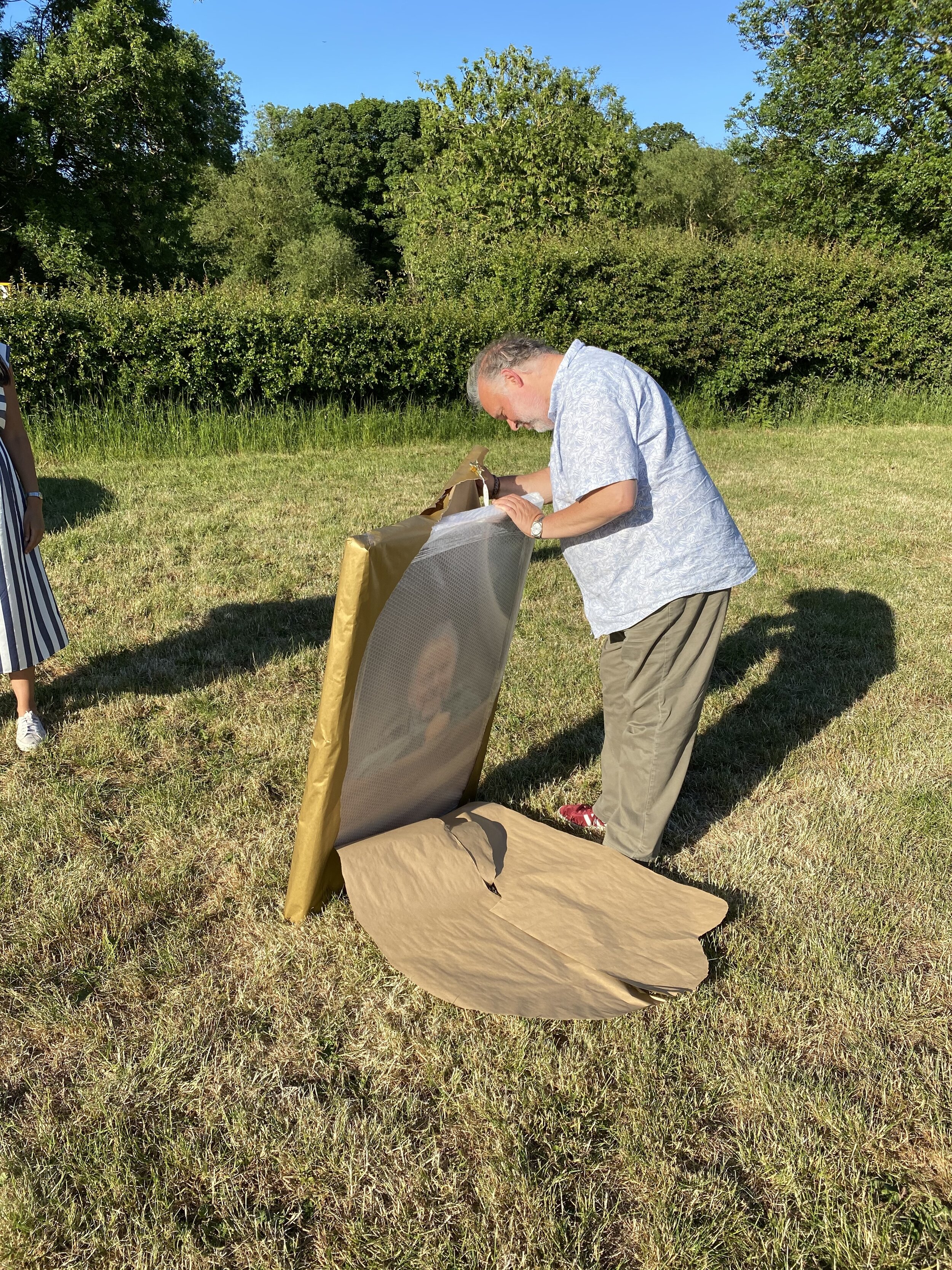
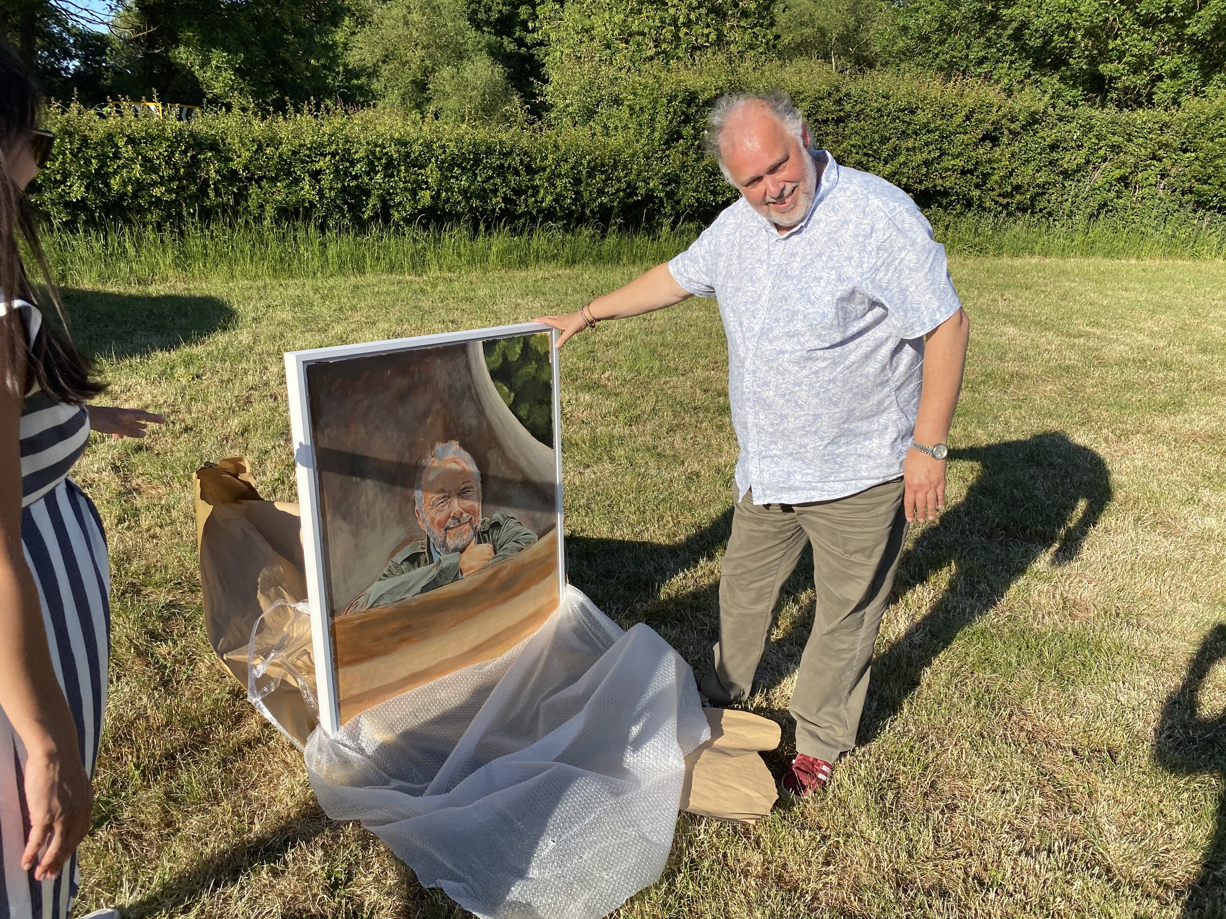
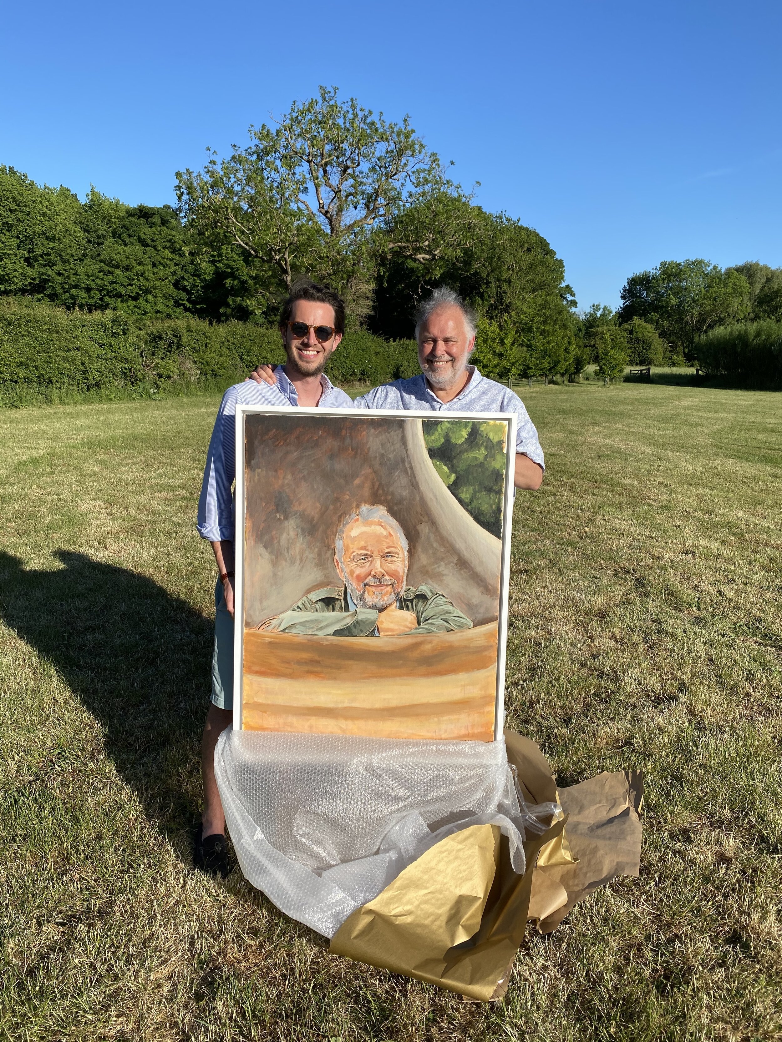
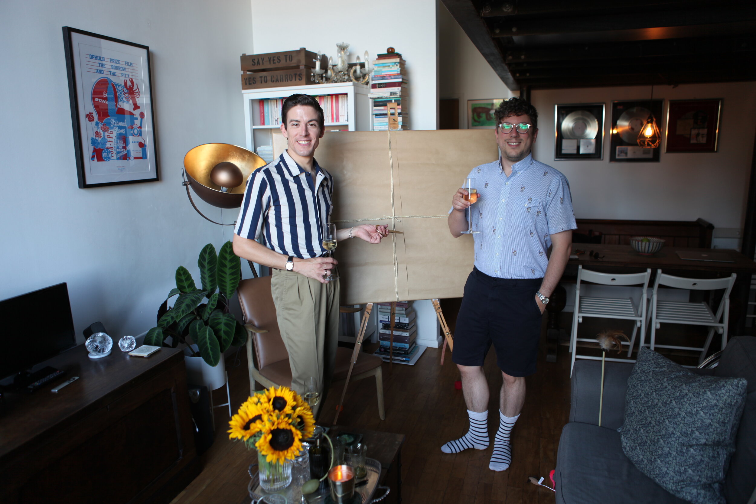
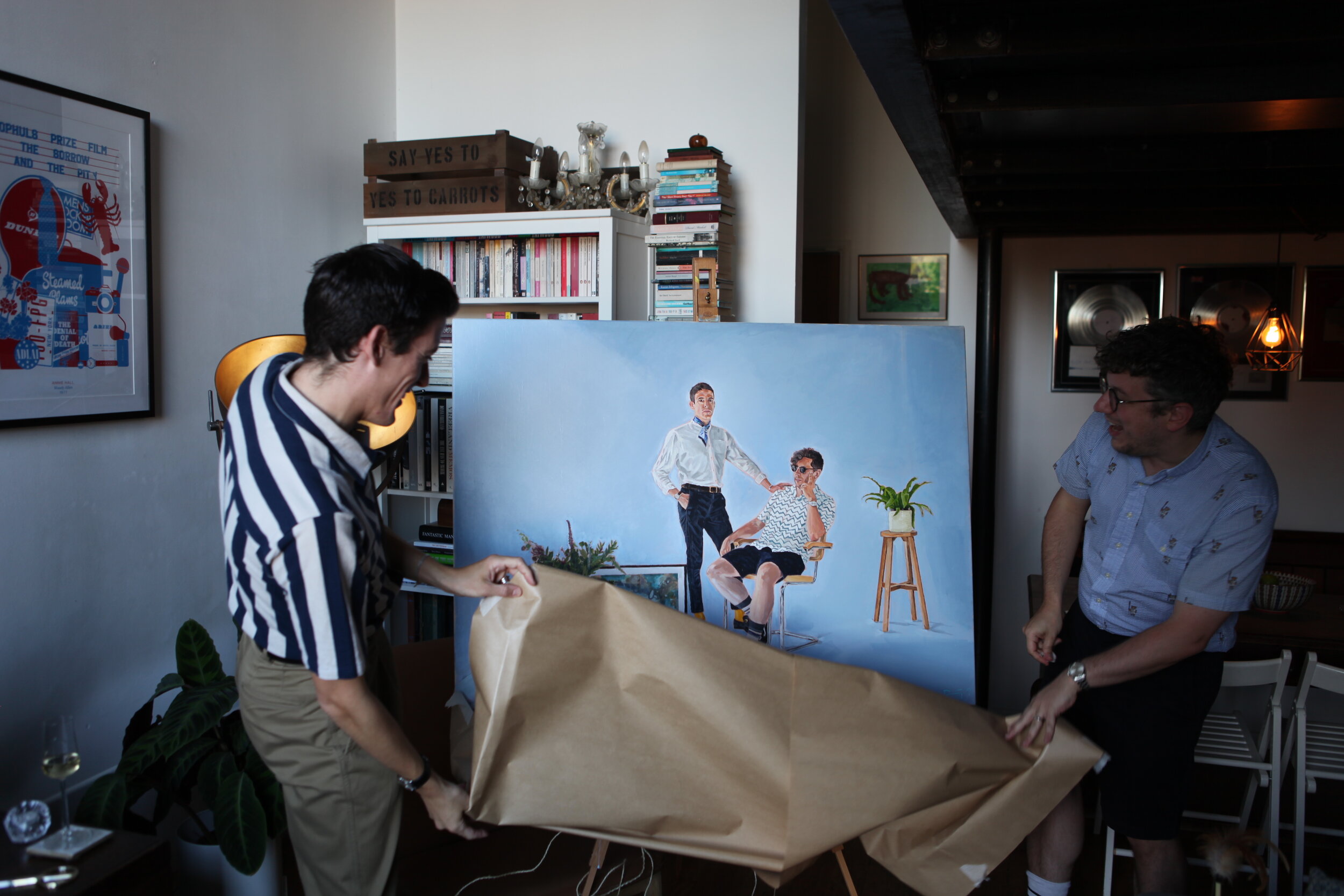
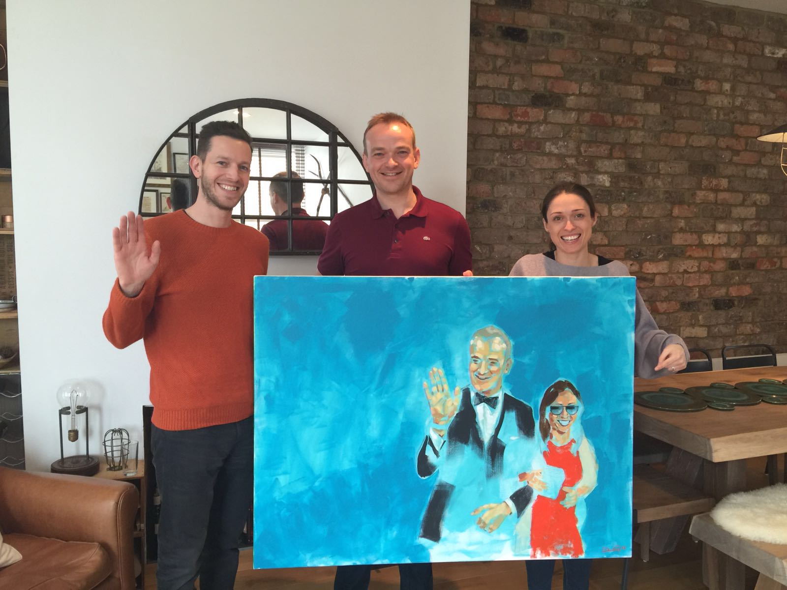
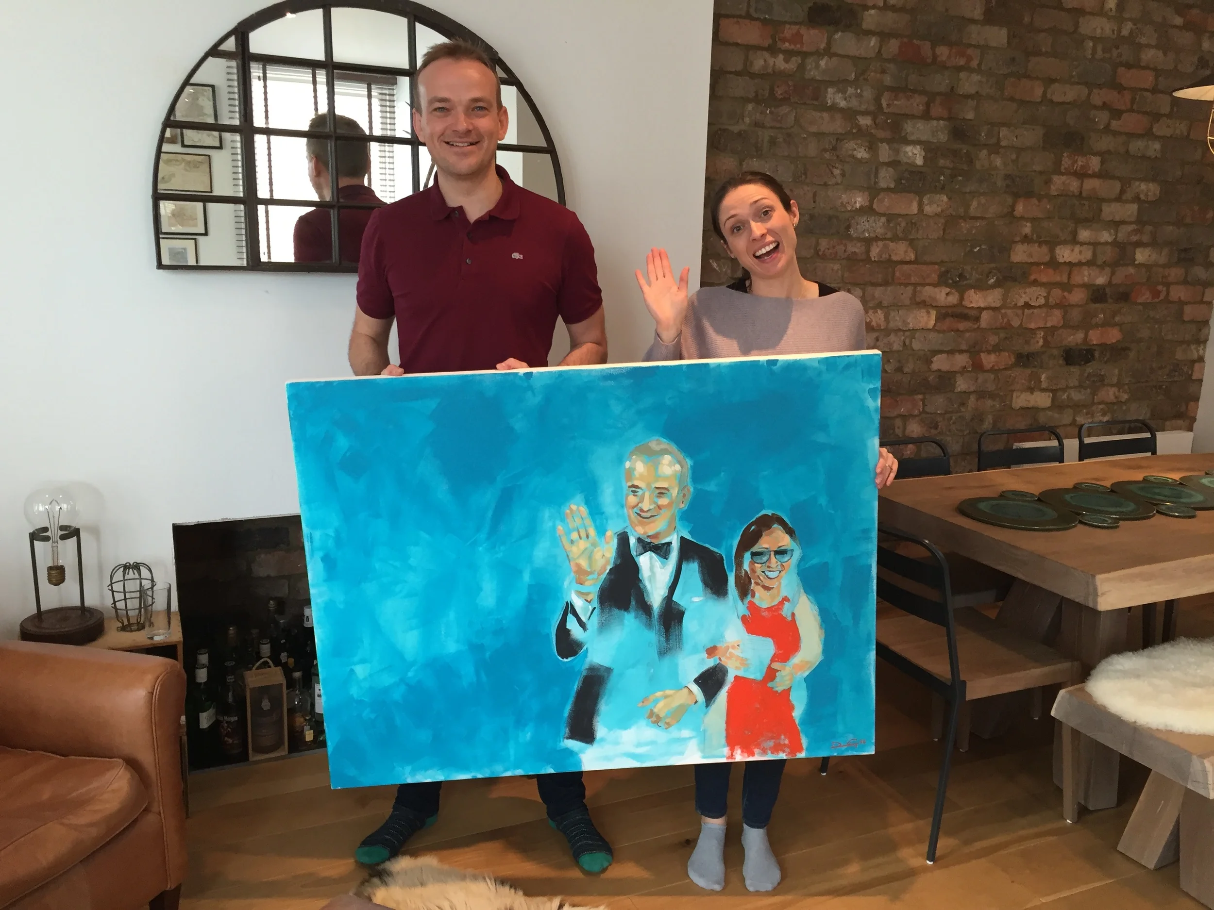
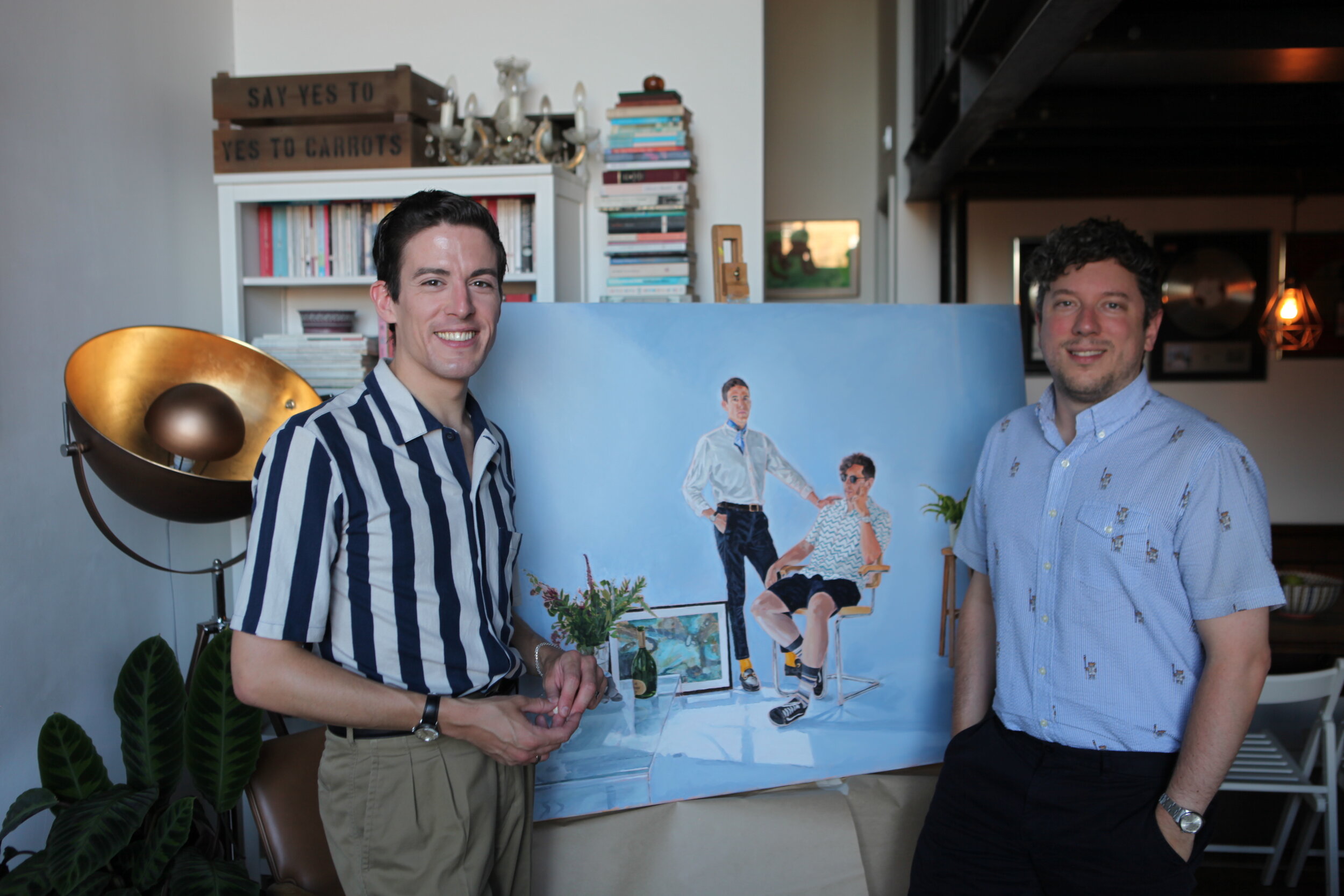
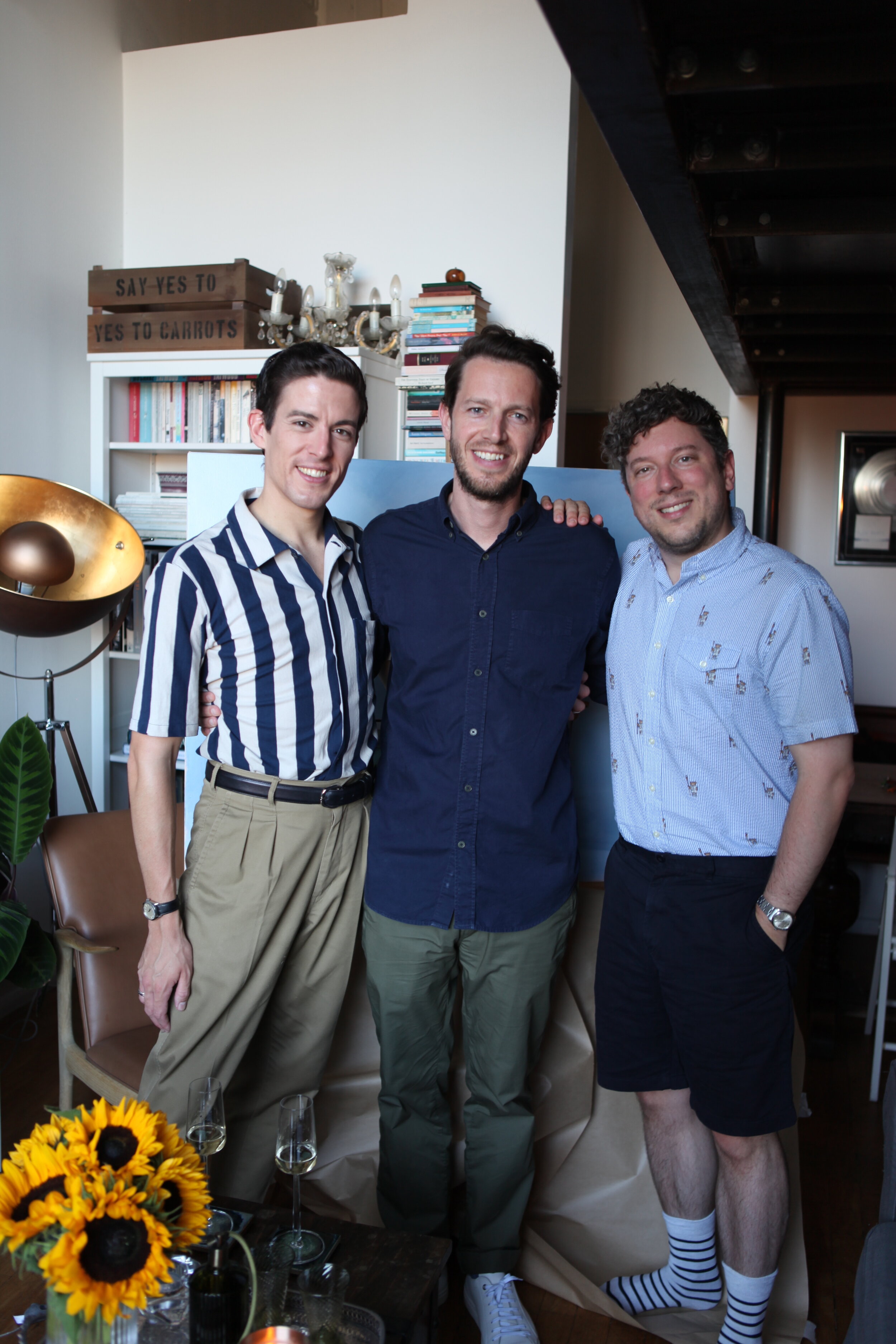
MR & MR ASPINALL AND HALLOWES unveiling...

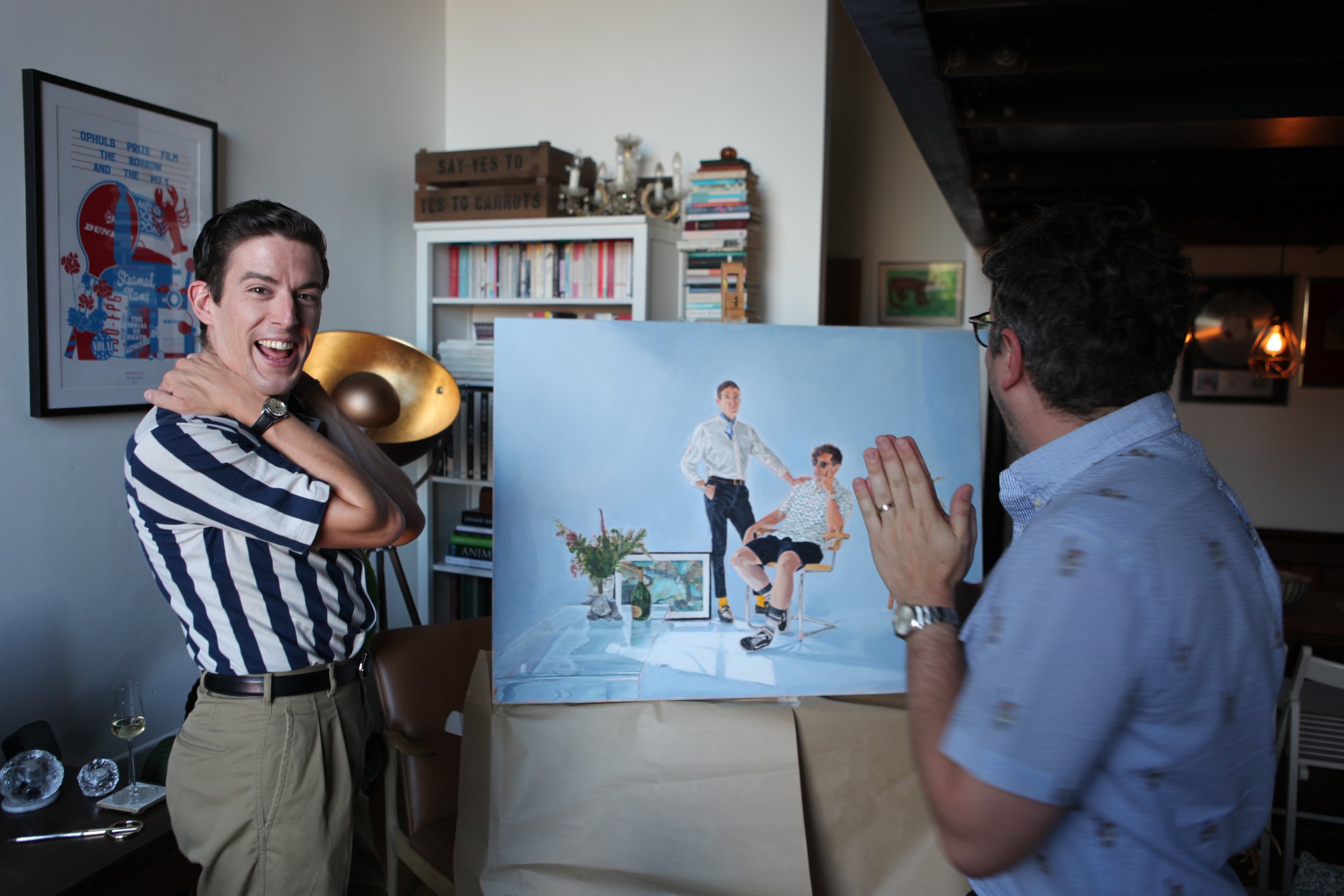
Here are a few pictures from the presentation of the final 

 portrait, always a fun thing to do…!

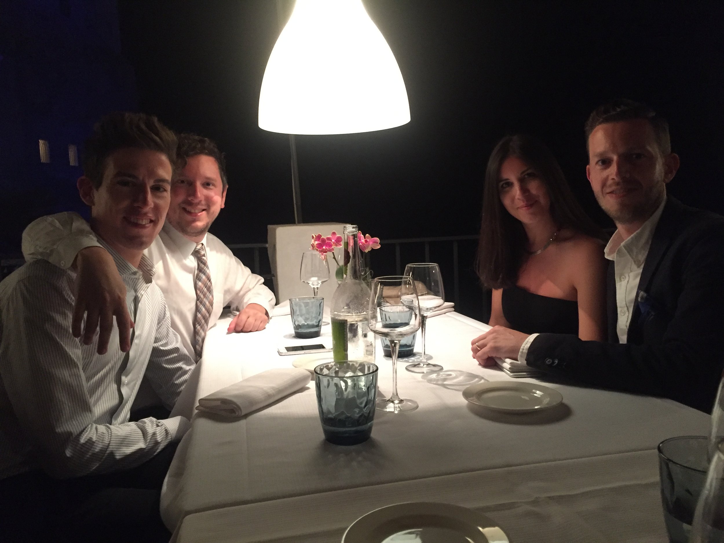
From conception to the presentation took several years in total. From the idea a dinner in Italy in the Summer of 2016, from a photoshoot in a warehouse in Shoreditch.

  Fortunately, Christopher and Stephen liked it and it’s now pride of place in their new home in London Fields. 

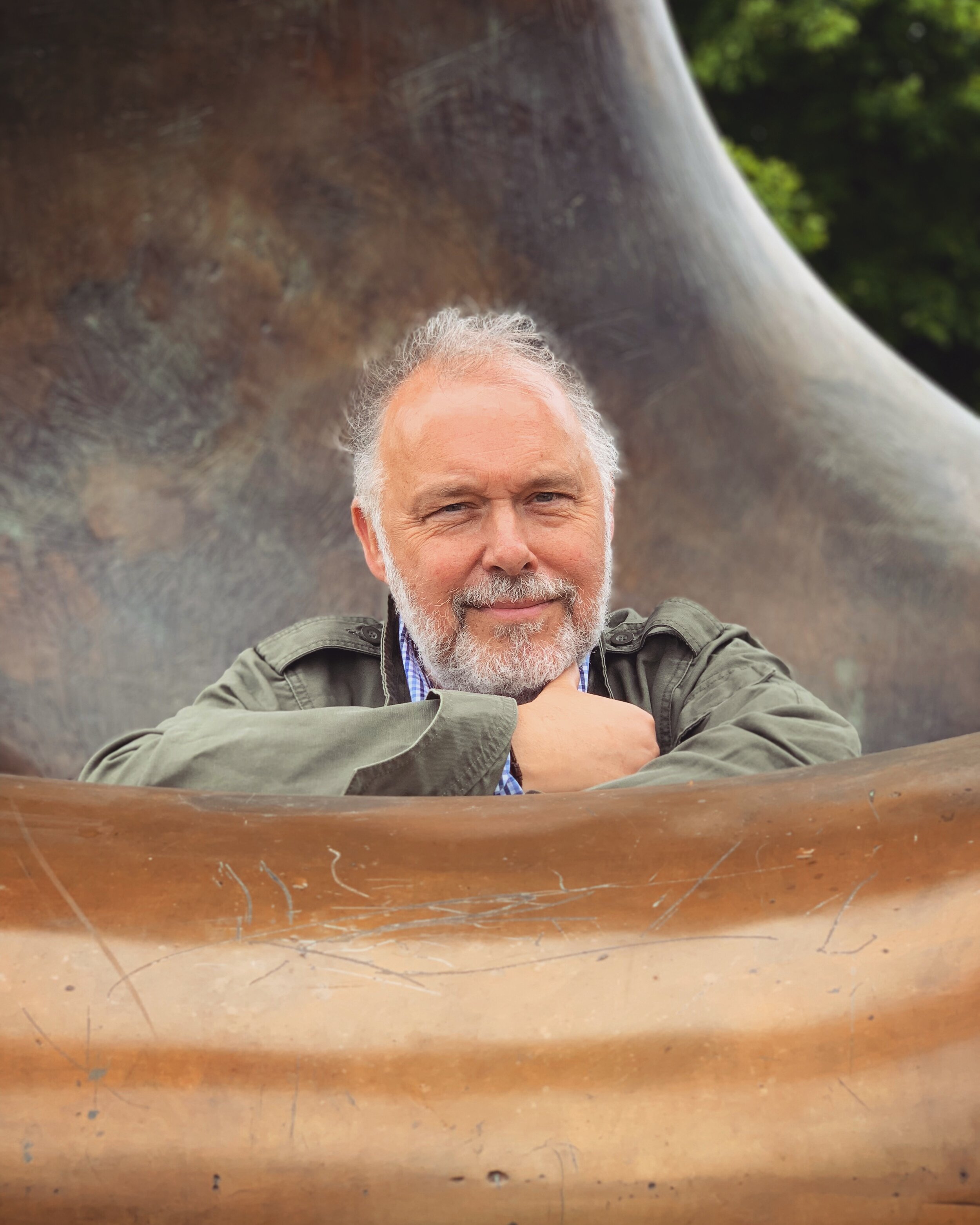
KEN at MOORE’S HOUSE 2020

My latest portrait is of my father in law, Ken.  I took the source photograph of him at Henry Moore’s Studio and gardens, near Much Hadham in Hertfordshire. 

Ken is situated inside one of his iconic and world famous sculptures, leaning forward on the inside.  Ken is wearing his favourite Che Guevara olive Army style jacket, which compliments the metallic brown hues and harmonises with his grey beard and hair.  In the top right is a tree in the distance, bringing a 3 colour layer to the background, which helps give depth and the flash of green warmth to the brown tones.   

As soon as I took the picture, I knew it would make a good painting.  Aside from the composition being pleasing – with the brown graduation of metallic Bronze surfaces.  I felt that Ken’s gaze expressed a feeling of honesty and contentment.   This was only 1 week before a life improving heart operation, so thematically I wanted to paint a portrait which captured that moment in time as a memory.
At one stage I way experimenting with the idea of turning the bronze red in colour, as I felt the curved surfaces and lines were like the inside of a heart’s atriums and ventricles.  After doing a few test studies and it looked overly literal – so I kept it true to real life and from the photograph.

Technically – I was happiest with the nose the most.  Always such a tricky off centre angle and his hair on top I kept loose mark making to keep the focus on his gently squinting eyes.

LUCY HALL PORTRAIT

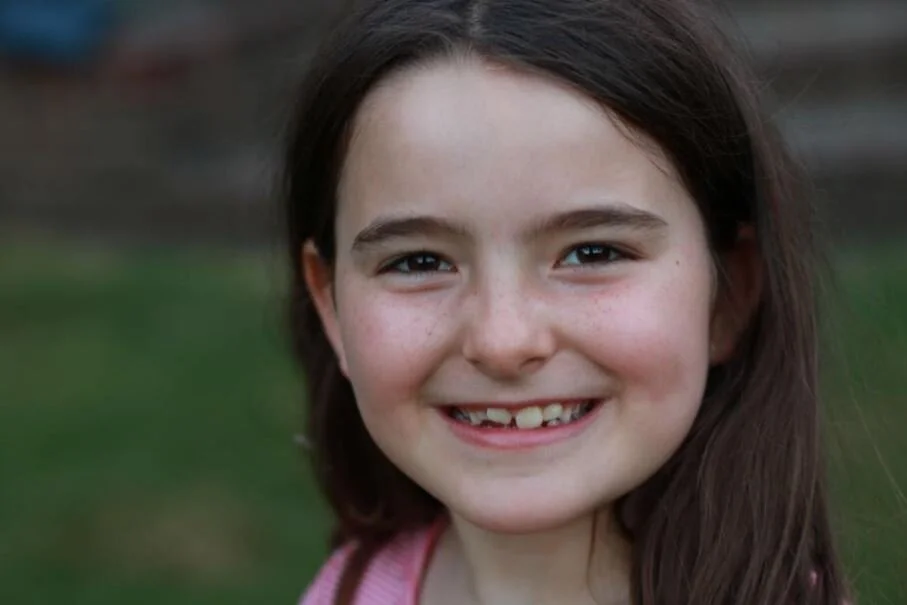
My latest portrait is of 6-year old Lucy Hall.  Commissioned by her father James Hall. James and I had been talking about a portrait of Lucy for several years, having discussed several photographs we hadn’t found a picture of her which I thought would make a good portrait painting.

Intimate photograph of Lucy’s face, with her characterful, tender, joyful look on her face.  Cute teeth and freckles.

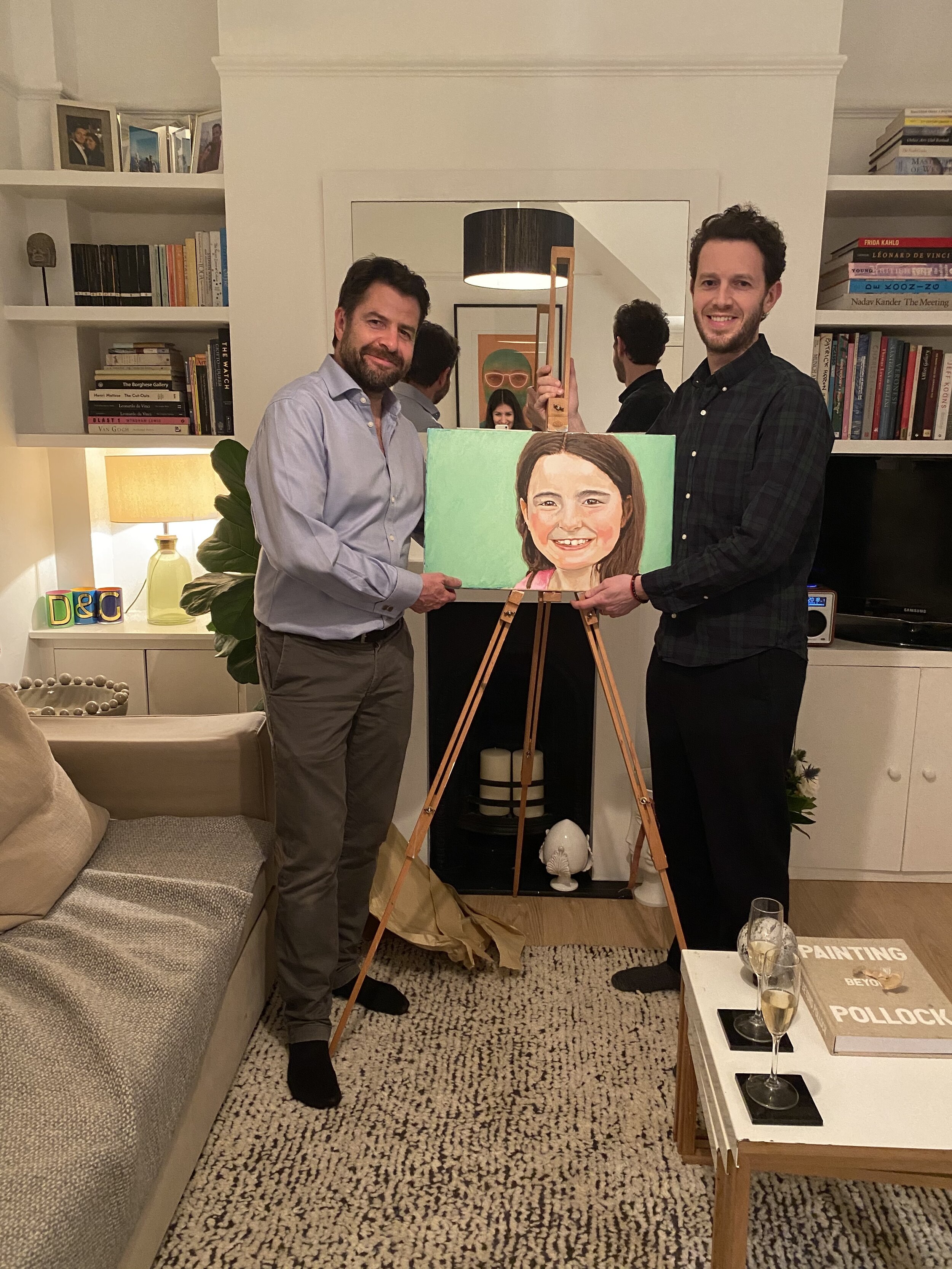
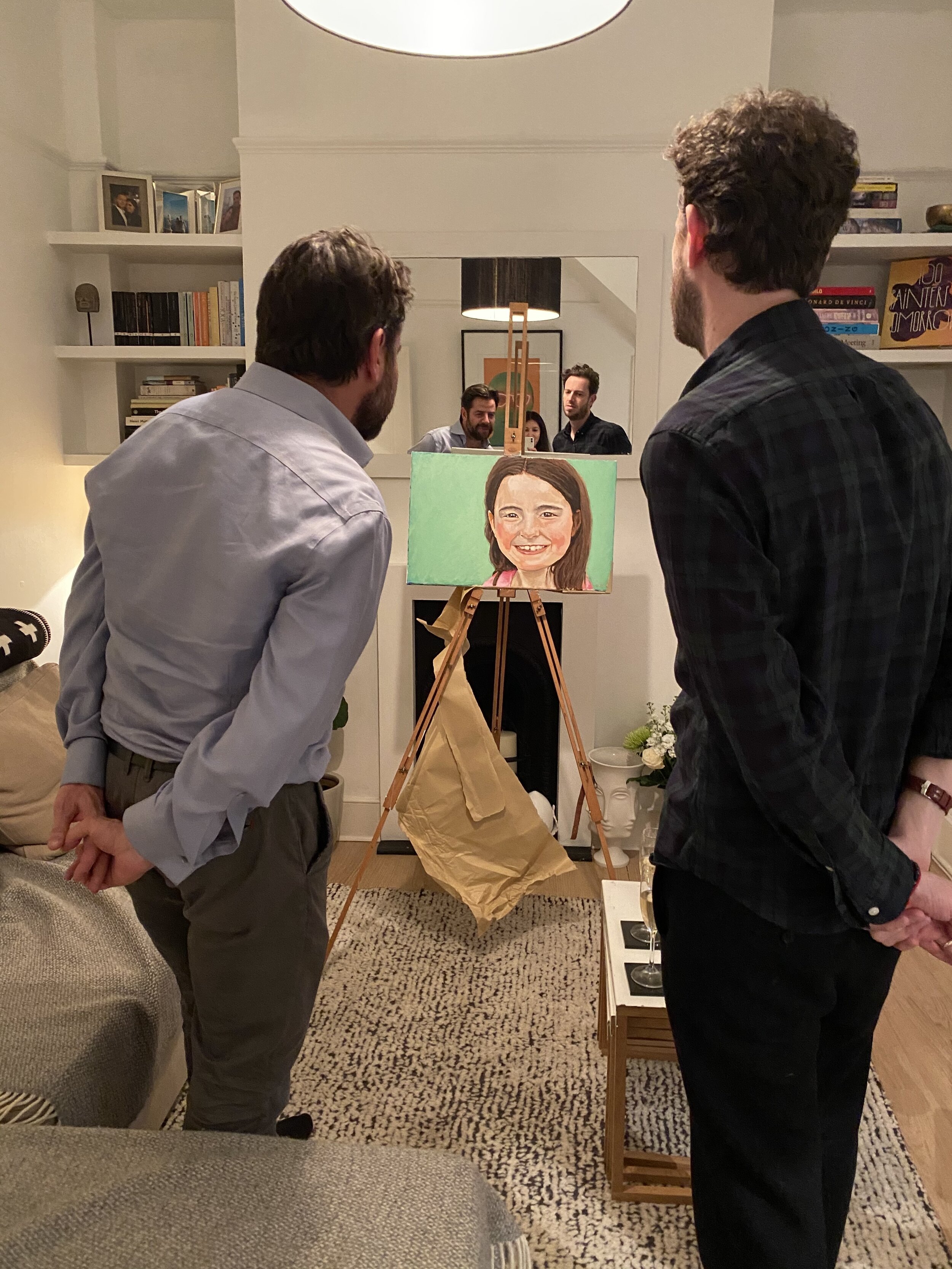
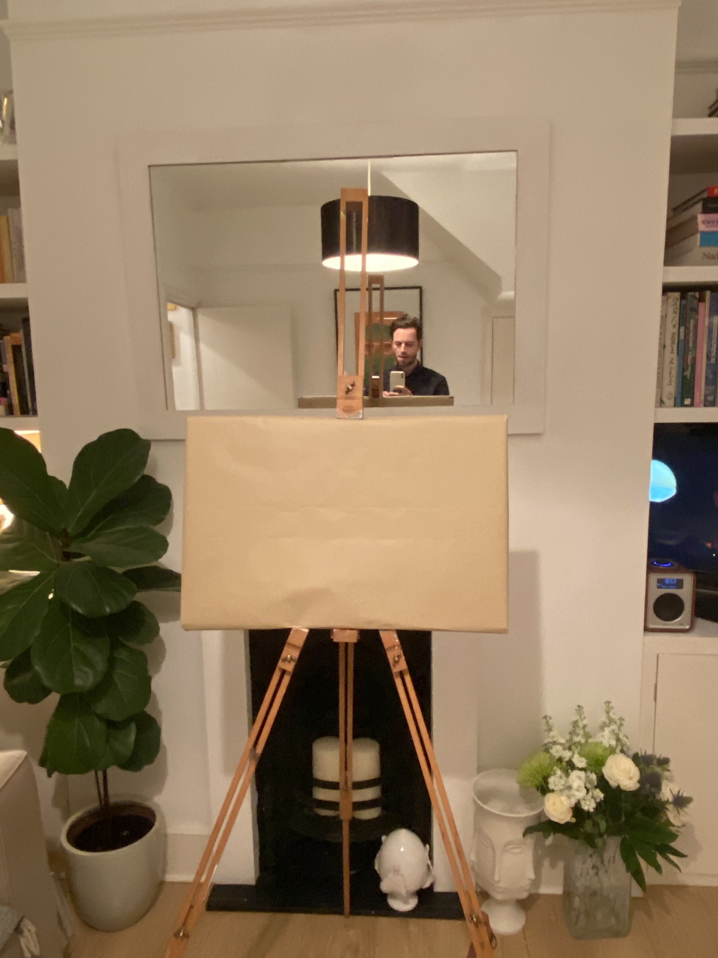
Here are a few pictures of the patron James Hall  on the evening of the unveiling.  I wrapped the picture up in brown paper, as is now the custom…

Another happy customer.  And apparently Lucy loved the picture too…

MR & MR ASPINALL AND HALLOWES UNVEILING

From an idea that in the back of a taxi cab in Puglia, Italy.  To seeing an inspirational Hockney painting in the Tate Britain.

My newest portrait painting took over 2 years to complete.

1 photo shoot in East London

9-days of painting, totalling around 80 hours. 

….and a total 8 poster studies, before starting work on the main canvas.

This investment of time was not what I originally planned, it grew organically this way.  Put simply, it took that long to complete and fortunately I had the time to invest.  The level of detailing in this picture is much higher than I tend to make naturally, but as a nod to the Hockey that it was inspired from – as this had a high level of realistic detailing to the people and the environment.

I had mentioned how the painting came about in a previous post but to re-cap. Several years before the painting even existed as an idea - we, myself and the portrait’s subjects had visited the Tate Britain and seen the giant David Hockney portrait – Mr & Mrs Clark; a tour de tour of neoclassical painting.  This painting became the inspiration for their portrait’s composition and to a degree some of the themes.  I wanted to keep the same casual seated pose of Mr Clark and even sourced the same Eames chair he sits in the 1970’s picture.  And the standing pose of Mrs Percy Clark.  But my painting had to have themes that were closer to a traditional wedding portrait, showing the pair as a happy couple.  I did this primarily by having Christopher’s hand on Stephen’s shoulder, showing support and connection.  I asked them both to wear whatever they felt like, as long as they matched and visually complemented one another. Further to this, they brought a selection of personal items to augment the scene.  From a bunch of wedding flowers, a bottle of Champagne, and a cuddly toy sat on a glass table, to a painting by Stephen’s mother.

So, with the composition prescribed from the Hockney painting, as well as the symbolic objects in the scene.  The next creative decision was the colour of the background.  I originally intended the background to be a file of block colour and during the process, I had toyed with the idea of painting the room to a high level of detail, but the set on the photoshoot wasn’t dressed to paint directly.  The white hanging sheets look scruffy and didn’t carry the regal air to the portrait; so block colour it had to be.  I came to the decision of using a powder blue, which turned silvery with the strong light vistas coming in from the top right of the composition.  And Blue has a good regal air too I thought.  The underpainting of the background was a warm peach/orange tone, to give warmth to the skin tones, as well as a complementary to the powder blue top colour.

Here are a few pictures from the unveiling of the painting back in October 2019:

The MID WALES ART CENTRE - May Day Bank Holiday visit

A weekend trip to see the work of Stefan Knapp at the Mid Wales Art Centre, founded and run by Cathy Knapp. Stefan was an internationally renowned enamelist and sculptor, he left a unique collection of paintings and sculpture which are on display in the house and grounds. The Art entre includes a Sculpture shed, park and hall - which is the only permanent collection of Stefan Knapp's work in the world, set in the idyllic rural area of Mid Wales. 

I had not seen his work for over 20-years, since it was on display at his house in Sandhills, Surrey in the mid-nineties.  And I felt as if I was looking at the work with new eyes.  Seeing as I was only 15-years old when I first saw the work, at the age of 36 now the viewing was a different experience. With a variety of canvases and sculptures kept inside of the house and his large steel enamels outside on display in the courtyard and sculpture hall. 


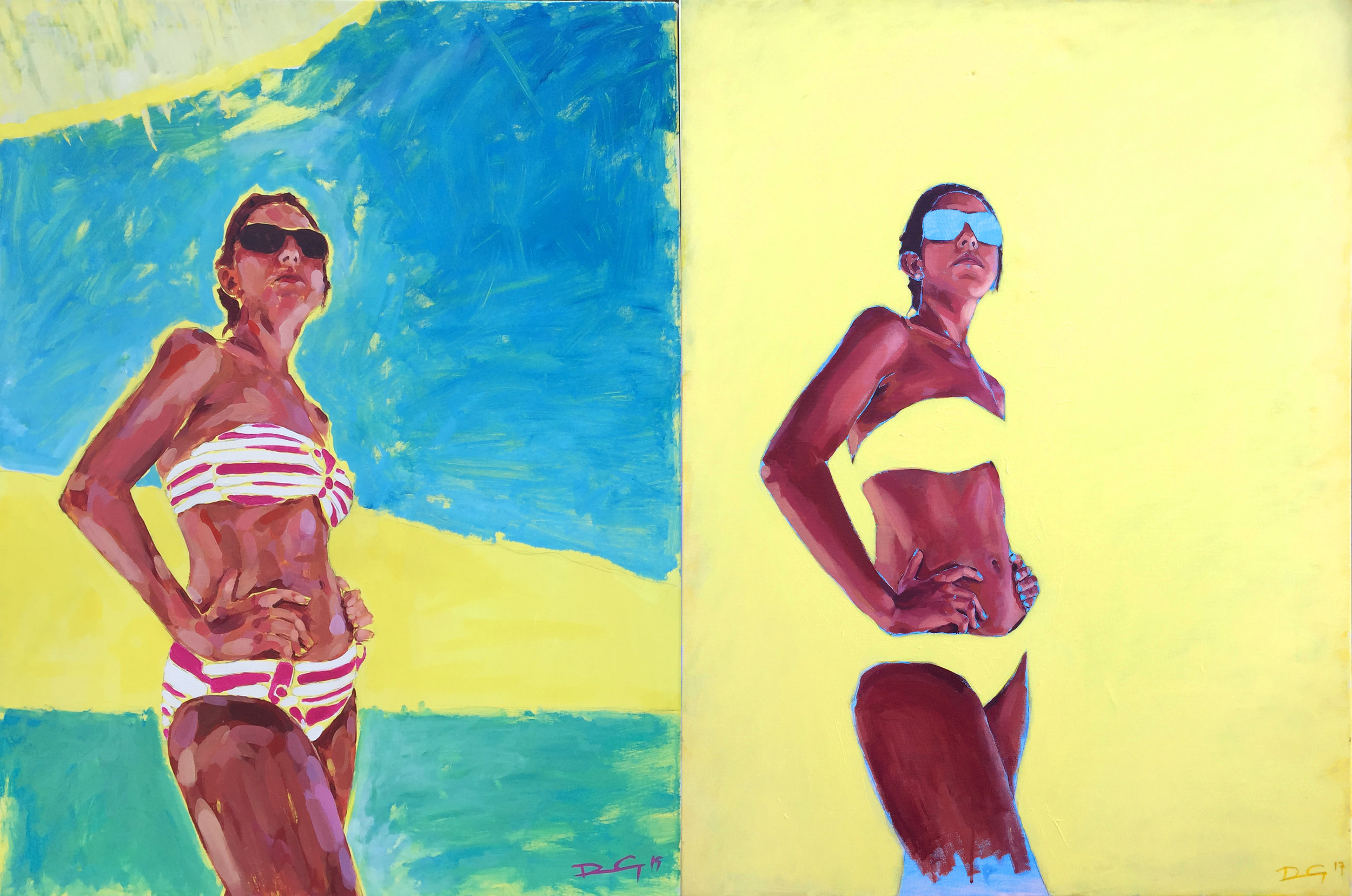
LINDOS. REVISITED

This is the first time to me, to revisit a paintings design and do a ‘re-work’.

But why re-work it?

I wasn’t happy with the previous paintings final outcome; The experimental background unsuccessfully distracted from the pictures figurative subject.  Which really should be the focus of the viewer's gaze.

To to drive this change, I took a work in progress photograph of the 2015 painting which had just the skin tones blocked out against a pure yellow background.  This photo has formed the basis of the new painting.

Keeping the composition true colour field at its core - Purple and yellow a complementary colours, with an effective interplay between a dimensionless colour field and a floating figurative subject. 

The composition is from a photograph I took on a beach in Greece, with the figure predominantly in shade, with bounce light from the surroundings. 

I have altered its composition, adding more lower leg, which exaggerates the perspective of looking up at the subject. As this was one the most successful aspects of the previous painting.  Drawing the viewer’s eye upwards to the subject's face.  The face is reduced in size due to foreshortening, by looking upwards across the body with a hands on hips pose, conveys a strong confident stance, yet an intriguing calm gaze off into the distance...

Tried to make the yellow glow using a high chroma Cadmium yellow light, making it the lightest tonal value on the canvas

I kept the blue underpainting layer through for the glasses and the lower legs, which seems like an on-going theme in my recent work. This is purely for aesthetics and has no deliberate meaning.

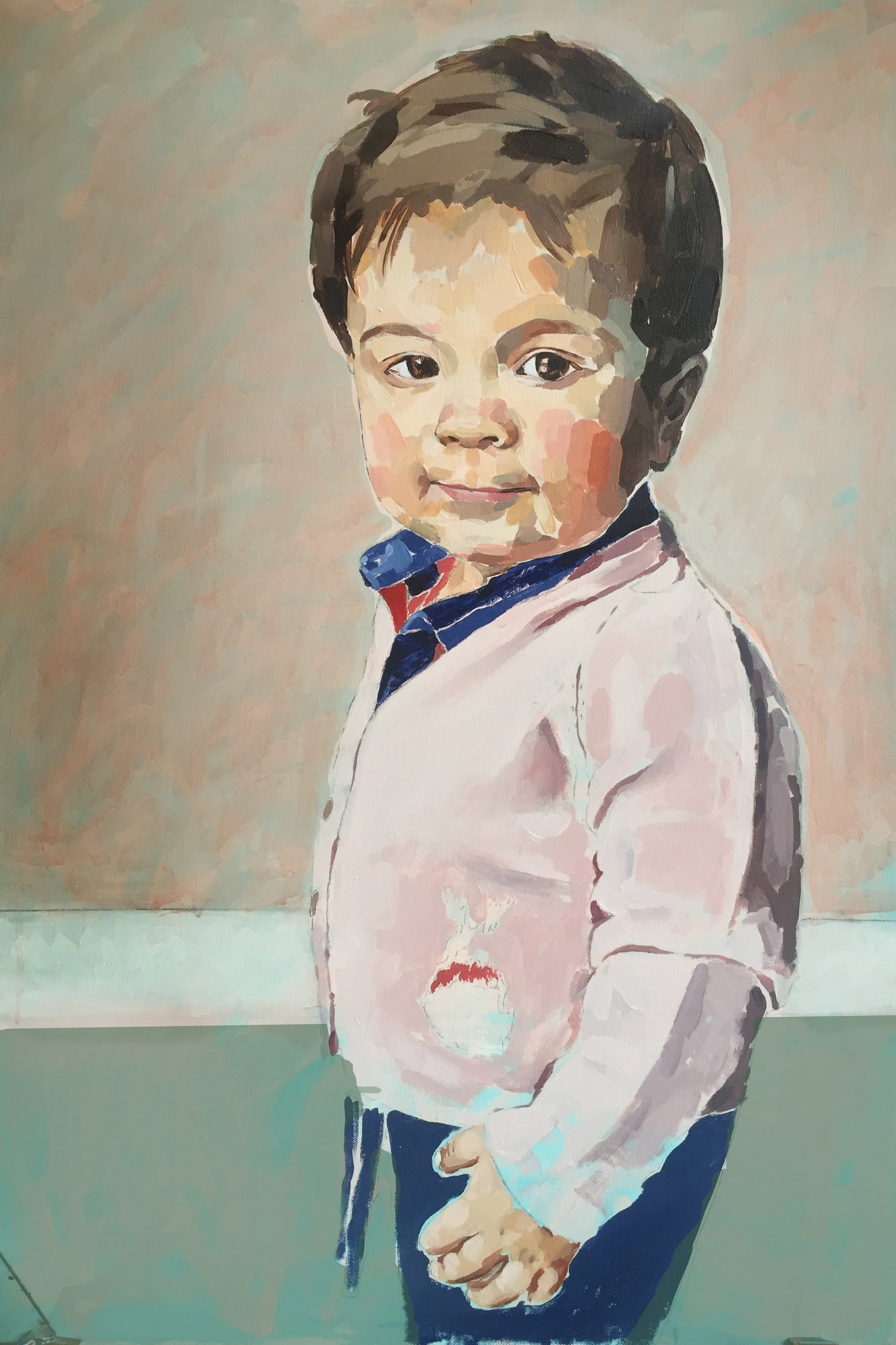
Sebastian Smith Portrait

My first portrait of a child... The most characterful Sebastian 'Boris' Smith. Amazingly gown-up looking for a 14-months year old. 

I admit that I put an inordinate amount of consideration into the composition of the painting, and the portrait itself was painted over 8-days in intervals.  My deliberateness, was mainly due to it being a new type of subject matter and how to effectively treat it, but I am pleased with the results. 

The background proved to be the most difficult colour to get right.  As originally I painted the room background with a grey, but that drained out the colour in his face, so the pale burgundy colour worked well in the end.

After presenting the painting to his father,  I found out that the pink cardigan that Sebastian is wearing was knitted by his granny and has been handed down from father to son.  

An earlier version with the different coloured backgrounds... before the final pale burgundy colour. 

An earlier version with the different coloured backgrounds... before the final pale burgundy colour. 

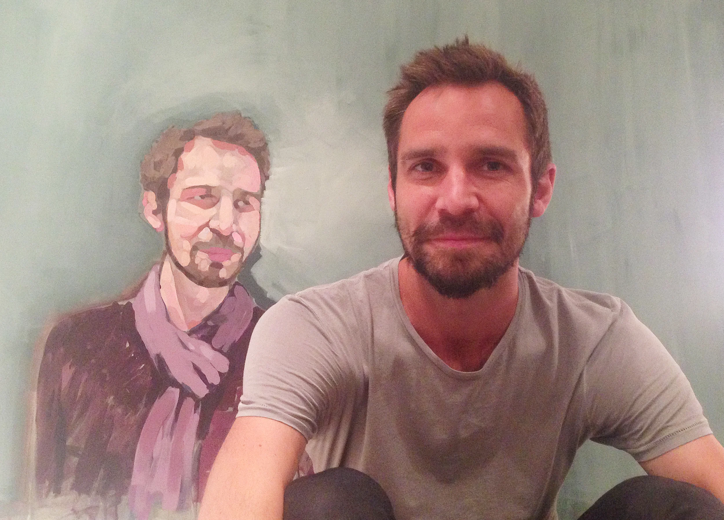
Daniel Wyatt Portrait

Im thrilled with this portrait of Daniel Wyatt... Almost as thrilled as I was when Nikki Hoar commissioned me with this painting.  I admire the leap of faith it must be asking someone to paint a picture of their partner.  It was for Daniel's 30th birthday - no pressure on me (I thought).  On a more serious note, when I saw the original picture I was completely taken with it and knew I had some great creative options to make a successful portrait painting. 

The pictures below are from the moment that I presented the painting to its patron 

RAVELLO WEDDING – 120.0 x 90.0 cm – Acrylic on Canvas. 2016.

The composition is from a picture taken at my own wedding,  I kept my brush strokes gestural and free, leaving areas unfinished, such as the suit and handbag.  With the base layer of blue paint coming through, to give it an abstract edge. 

A picture of me and the portraits subject... In Greenwich, London. 

A picture of me and the portraits subject... In Greenwich, London. 

A second picture of me and the portraits subject...  

Back from Stockholm - with new painting Ideas

I am fresh back from an amazing trip to the Moderna Museet in Sweden, full of ideas and new inspiration.  The entrance wall of which is in the picture below, it is a state museum located on the island of Skeppsholmen in central Stockholm. 

Moderna_Museet.jpg

The outstanding work was from Trisha Baga, a young artist working mainly in video and performance. Her approach is open and intuitive, with a homespun aesthetic that might incorporate screen effects, recordings of herself over soundtracks, scenes spliced together and improvised props. She adopts truly engaging multimedia approach.  Watching her short film Hercules in 3d glasses projected into an enormous installation space, I didn’t expect the piece to have such funny tongue in cheek moments.  For instance a cut out rabbit bounces across the bottom of the screen, Monty python style!  Its so unusual to see a piece of art that is not only engaging in a audio visual sense, but is also amusing for the viewer. Do have a further read here, I could not recommend her playful work anymore 

http://vilmagold.com/artist/trisha-baga-2/

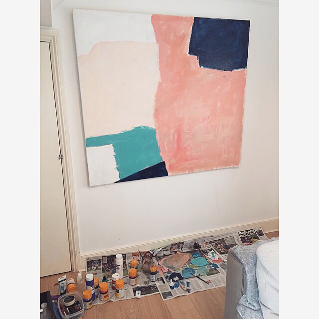
Since I've been back from Sweden, I have been thinking more about my painting subject ideas; I've experienced somewhat of a creative inaction. A type of stalling created, inadvertently by having too many ideas in my head at one time.  This block or better worded as a stall - reached it peak on Sunday with a spontaneous outbreak of painting.  I have a space in my living room, and a pretty large 4.5" x 4.5" blank canvas, which has now been filled with amber chalk, pale pinks, redish creams and dark imperial blue shades; the result of which im rather pleased with. At has a very least ensured I have committed pen to paper so to speak.

Before I sign-off, I wanted to leave with one last thought. I have been considering creating a set of paintings for a solo show after the summer this year. The theme of which will be portraiture 


The Cows - UNVEILING

I am delighted to announce that my most recent portrait painting entitled 'The Cows' has been presented to it new owner.  

photo 3.JPG
photo 1.JPG